With Colour Management,
nobody can hear you scream...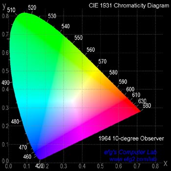
I've been putting off trying to understand "colour management" for some time. Life seemed too short.
Back in the dim and distant past I occasionally used to do colour prints in the darkroom and found it an annoying way to spend time. Make a print. 15 minutes later - oh, it's too magenta. Make another print. 15 minutes later - oh, it's slightly blue now. Absolute tedium. One of the best things about the digital revoloution was the ability to get prints with good colour balance straight out of the printer without having to spend hours twiddling around with colour filters.
So what went wrong? Well, I tried to use third party inks and paper with my Epson printer. Without wanting to sound like a conspiracy theorist, I think Epson have cunningly booby-trapped the whole hardware and software system to try and avoid anyone successfully managing to use any inks or papers not manufactured by Epson. Unfortunately it seems that if you want to use non-Epson inks and/or papers, you're going to have to invest at least a day experimenting with something you don't probably don't need otherwise - colour management. You'll probably need to invest some money in profiling software too - I'll get on to that later.
What is Colour Management ?
Getting good colour prints in an old-fashioned darkroom was largely a matter of technique. It was tricky, but conceptually quite straightforward. Colour management on the computer is a whole different kettle of balls. Or do I mean fish park... Anyway it's a highly confused and confusing area, both conceptually and in practice. There is a great deal of literature of varying levels of complexity which you can read if you're really interested - see the links at the end of this article. If you just want to get good prints the good news is you only have to understand a small fraction of this dark satanic pit of digital alchemy. The even better news is that I intend to explain it for you here, in terms that even simple minded folk such as myself can understand.
Colour management is necessary because our human eyes are pretty amazing, but fantastically expensive as it may be, none of our computer darkroom equipment is perfect. If scanners, monitors and printers could scan, display and print the entire range of colours which the human eye can see, we wouldn't need colour management. Colour management is a fudge to make up for the fact that each device has different limits and deals with colour in a different way. Each device has its own "colour space", which defines which colours are within its range and how it deals with those colours.
Some jargon
This is one of those areas where understanding the jargon can save hours of frustration. These are the main buzz-words you need to know:
Gamut = range. The printer's "colour gamut" is simply the range of colours it can print.
Colour Space/Profile = a computer file which describes how a certain specific device deals with colour in certain circumstances. A printer profile tells the computer how a certain printer, with certain inks and certain paper is going to print out your image. A different colour space/profile is needed for each different type of paper and ink even if the printer is the same. The same printer/ink/paper combination may need a different profile in summer from the one used in winter - so profiles are very specific! A monitor profile tells the computer how a certain monitor displays colour on a certain day in certain lighting conditions. The same monitor may need a different profile when used at night from when it's used during the day and natural light falls on it... and even used in the same conditions it may need to be re-profiled every few months as the phospors inside it age. I told you this was annoying stuff!
Working Colour Space = something entirely unnecessary and confusing. Despite the fact that the one thing which is potentially unlimited by physical realities is the "pure" information stored on your computer, there is still a whole load of nonsense associated with the version of the image you work on in Photoshop. The bottom line is, chose "Adobe RGB 1998" in the colour management settings. There are a whole load of other unnecessary options, some of which may reduce the quality of your final image.
ICC/ICM = standardised colour space profile. ICC is short for International Colour Consortium, or Intergalactic Colour Cops - fearless defenders of perfect colour throughout the universe. ICM stands for Image Colour Management. Colour profiles on the PC have filenames such as"printer profile.icm" or "printer profile.icc" - they are interchangeable. ICM is Windows' way of implementing the standard ICC profiles. Macs have something else - Coloursync, which is also ICC compatible. Essentially ICC and ICM are interchangeable terms, although it's not always quite as simple as that - I told you this was confusing! Anyway the idea is that profiles follow a standard pattern so that they work on the PC and the Mac, and that everything is compatible and everybody lives in peace and harmony.
Lost in (Colour) Space
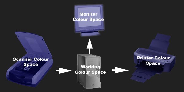
Our aim is to make prints with colours which look the same as the ones we saw when we originally took the photo. The confusing thing for me is the fact that the majority of the "colour management" which you need to do can be achieved without ever going anywhere near ICM/ICC profiles! I've been making perfectly good prints for ages knowing virtually nothing about ICC colour management. Consider the following workflow:
Photo taken with Minolta film camera with Tamron lens using Fuji colour negative film. Developed in Kodak chemicals. Scanned with an Acer film scanner. Displayed on a Hansol Cathode Ray Tube (CRT) monitor. Printed on an Epson printer using Epson inks and Epson paper.
By the time the print comes through that range of devices and products, there is only one thing which is going to keep the colours looking like they did on the day, and that's the photographer's eye for colour. At more than one stage along the way the user has to fiddle around with colour controls in order to drag the technicolour nightmare which appears on the screen into the harmonious world of pure colour. With a bit of luck it's possible for everything to come together without going anywhere near ICC colour management. The image may be converted from shades of orange on a colour negative to beautiful colour using specialised software such as Silverfast or Vuescan. As I understand it, these packages don't use ICC profiles, but custom formulae. The monitor may have been calibrated using the colour controls in the Windows display driver - again not necessarily "ICC aware" but custom software. Finally the print could be made using the Epson printer driver with all ICC options switched off - the printer driver is pre-calibrated for Epson ink and Epson paper, and does not need ICC technology to achieve that calibration. Colour management in its wider sense has taken place, but ICC technology has not been used.
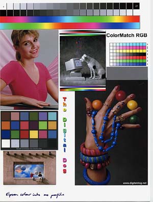
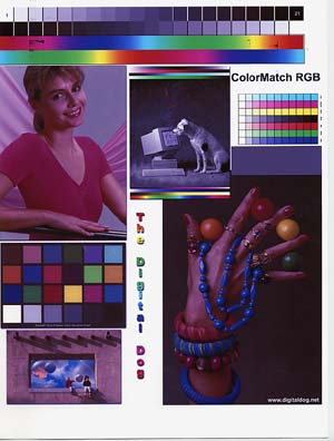
But what if you change the workflow a little bit and use Lyson inks instead of Epson ones? Now everything's coming out blue! Oh no! What can I do! Unfortunately, it seems learning how ICC colour management works, and making your own profiles for the printer/paper combination you're using is the only answer to that question!
|
Lyson paper with Epson ink, no ICC profile |
Same settings, same Lyson paper, but with Lyson inks. AAAGH! Of course, Lyson have a solution - ICC profiles! |
Spark Plugs
One of the excellent articles which I will refer you to at the end of this piece is by James King of Adobe Systems. In his conclusion he makes an analogy between the current state of colour management and early cars where the drivers had a control called "spark advance". He says the exact timing of when each spark plug has to fire to make the petrol explode in each engine cylinder has to be adjusted depending on how fast the engine is running and how hard the engine is working. I am prepared to take his word for it! Drivers of early cars apparently had to learn how to set this "spark advance" as the car was accelerating, decelerating and when starting the engine. Modern engines still need this to be done - but it is all done automatically. In my lifetime I have seen computer printers go from being able to produce incredibly crude black-and-white images (very noisily!) to being able to produce output which is in some respects superior to traditional darkroom photographs. But those of us who choose to use current "digital darkroom" technology are like the drivers of early cars having to adjust their own spark advance. Exciting, isn't it!