User interface design: If only Google made cameras
I feel inspired to write today because, for the second time in not so many months, I've been impressed with a piece of design. Amazingly, in both cases the product designed in a pleasing way was software, traditionally something where we risk disapointment merely by expecting it to work at all.
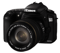
The Canon EOS 20D - quite good actually |
Others have been impressed with the Canon EOS 20D. I have to admit that, having used one for six months or so, from a photographic perspective I'm impressed too. It blows away my old EOS 100 film camera, although from a design perspective it's basically the same thing but digital.
At least the 20D benefits from a certain "if it ain't broke don't fix it" sanity and hasn't been redesigned just for the sake of it. Canon have managed to shoe-horn all the extra functions and settings the old film camera didn't have into not too many extra buttons without turning it into a Nokia 6230 (my current mobile "phone"). This textbook example of user-interface failure does all sorts of things its predecessor couldn't but sadly inherits a user interface which has evolved very little from its more simplistic forebears. The thing can play music, take photos and video, synchronise my calendar by bluetooth and make polyphonic mating calls to crazy frogs. But trying to make a phone call or send a text message on it regularly urges me to flush it down the toilet and go back to my old "real" phone. Although Canon have followed the same evolutionary design philosophy as Nokia, the EOS 20D has not so far risked a trip down East Londons sewers.
But I'm being unfair to Nokia. The textbook example of disasterous user interface failure is not their 6230 (unfeasibly bad as it is). It's Windows XP. Given that Microsoft is one of the richest corporations in the world and user interface design is all they do, this is perhaps surprising. But XP and Microsoft Office are a truly terrible pieces of design. In XP, like the BMW 5 Series, everything is buried within a sub-sub-sub menu, and there is the ability to pointlessly customise everything. This particularly annoys me off as I'm unfortunate enough to be one of those sad misfits whose friends, family and acquaintances call up when their PC doesn't work. Frustratingly, advising what to do to make the damned thing print depends on which of the 99 gazillion different user interface preferences the afflicted PC user has selected.
|
How do you like your annoying office assistant - Dog, Cat, Paperclip? |
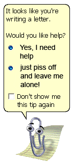
I find it difficult to restrain myself from a tirade, but in the interests of retaining readers I've restricted myself to one example of astonishingly irritating pointless customizability. Sometimes when I'm using Microsoft Word whilst a wee bit tired at the end of a 16 hour day in the office, my hand slips and instead of just clicking on the "bold" icon I accidentally hold the mouse button down for a few microseconds, dragging the button off the screen altogether so that it and all the other formatting options disappear. Fortunately, being the person who gets phoned about such problems rather they type who does the phoning, I can usually work out how to get it back within a reasonable time, but WHY?! When you go into a restaurant and look at the menu, you don't expect just to be presented with a huge list of ingredients which you need to put into order yourself. Microsoft simply serve up the ingredients and, seemingly in admission that they wouldn't be able to do it any better than the end user, shy away from actually designing the finished product.
What Microsoft don't understand is that with user interfaces, as with photography, simplicity is king and less is more. Google recognise this which is why they are going to take over the world. They have created the world's most successful product by sticking rigidly to this design philosophy. They may not have made any money out of it yet, but their search engine is nevertheless the world's most successful product because we all use it every day. Its just a white screen with a search engine on it which actually works. I think we're attracted as much by the lack of clutter as the results.
The two pieces of software Ive been impressed with recently share the Google design philosophy, probably because they are both Google software. The first is Picasa, the Google photo album. This actually works, and does so in a way which is a pleasure to use. How such a product can be given away for free with seemingly no strings attached is a mystery. Presumably they charge affiliates for providing links in the "order prints" section. In any event it is surely good news for the consumer to be able to enjoy a well thought out piece of design which blows away the competition and costs nothing.
The second joy is Googles mapping site. Without cluttering up the whole screen with crap, it does everything you could possibly want from an online map and more, with a beautiful, effortless user interface. It makes multimap and streetmap look like something you had to load off a cassette on the ZX Spectrum.
In the unlikely event that anybody at Google is reading this, I have a request. PLEASE write an operating system (perhaps a front-end for Linux?) and do to Microsoft's efforts what your search engine did to all the others. And once youve finished that you can start designing cameras